Streamlining Consumer Banking
Mobile Banking · Fintech · User Testing & Accessibility
01. Project Overview
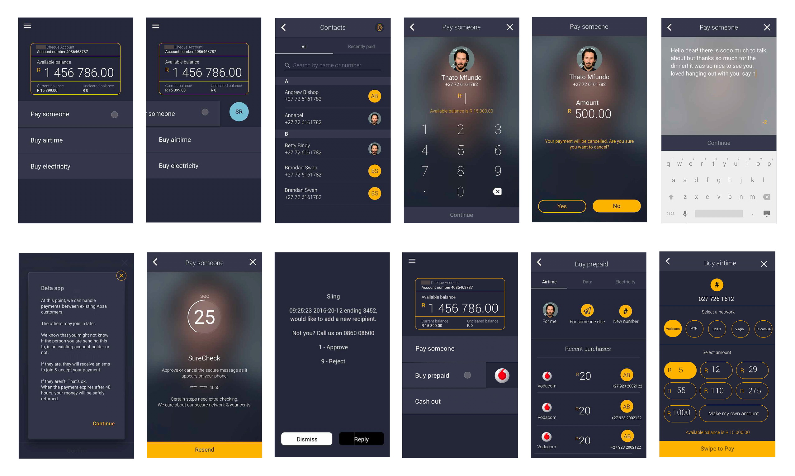
Sling is a mobile banking application designed to simplify daily financial tasks — such as money transfers, airtime/data purchases, and cash-outs — for a diverse consumer base. The project focused on refining the user experience by identifying friction points through rigorous user testing and implementing high-visibility UI improvements.
02. The Challenge: The Friction of Finance
Even simple financial transactions can cause user anxiety if the interface is cluttered or the feedback loops are unclear. Initial testing revealed that users struggled with:
- Discoverability: Difficulty finding key actions like ‘Cash Out’ or ‘Transaction History’
- Clarity: Confusion regarding balance displays versus available funds.
- Confirmation Bias: A lack of satisfying and clear confirmation when completing a high-value action (e.g., sending money).
03. User Testing & Key Findings
I conducted usability audits to observe how users interacted with core features. Key insights included:
- Interactive Elements: Users preferred tactile, gesture-based interactions over traditional buttons for final approvals.
- Visual Hierarchy: Essential data (Account Balance) needed to be the focal point without overwhelming secondary actions.
04. Design Solutions & Feature Highlights
The “Swipe-to-Confirm” Mechanism
To reduce accidental transactions and increase the sense of ‘action completed,’ I implemented a “Swipe to Buy” and “Swipe to Send” interaction. This deliberate gesture provides a psychological safety net for the user before funds are moved.
Optimized Utility Payments
I redesigned the Airtime and Data purchase flow to be a single-screen experience.
- Dynamic Menus: Integrated network provider selection and bundle options into a clean, vertical scroll.
- Smart Filtering: Options like 500MB, 1GB, and 2GB are presented with clear pricing and validity periods to ensure transparency.
Transaction Visibility
The Transaction History was overhauled to emphasize clarity.
- Color-Coded Status: Clear indicators for outgoing vs. incoming funds.
- Detailed Receipts: Each transaction expands to show full metadata (date, reference, and fee breakdown).
05. System Synoptics & Logic
Beyond the consumer-facing UI, the project involved designing the underlying logic for the banking system’s operational states. This included:
- System Diagrams: Mapping out Auto vs. Closed states for backend transfers.
- Failure States: Designing clear, non-alarming error messages for system timeouts or insufficient funds to keep the user informed rather than frustrated.
06. Visual Language
- Modern Minimalism: Used a high-contrast white and blue palette to evoke a sense of professional security and modern tech.
- Typography: Utilized clean, sans-serif fonts to ensure financial figures are legible on small mobile screens even in low-light conditions.
- Accessibility: Focused on button size and touch-target areas to accommodate users with varying degrees of mobile literacy.
07. Results & Impact
- Higher Conversion: The simplified Airtime/Data flow reduced task completion time by an estimated ~25%.
- Error Reduction: The “Swipe to Confirm” feature virtually eliminated reported “accidental” money transfers during the beta phase.
- User Satisfaction: Post-testing surveys indicated a ~80% positive rating for the app’s intuitive navigation compared to traditional banking competitors.